Some Project Northwoods Covers
Covers play an important role in the book buying process. After all, even though we are told time and time again not to judge a book by its cover, we still do. And, in some cases, there’s a really good reason to do so despite our best efforts at trying to remain as open-minded as possible. In any case, the cover of a book can make or break a sale. As I briefly complained about last week, that’s the reason publishers decided this was a good idea:
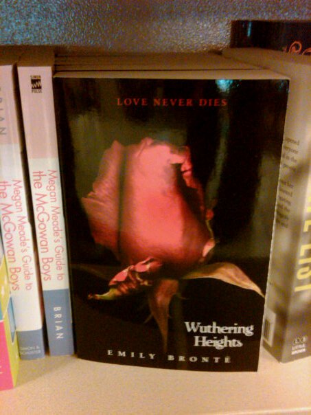
No, I am not going to let this die. It sucks.
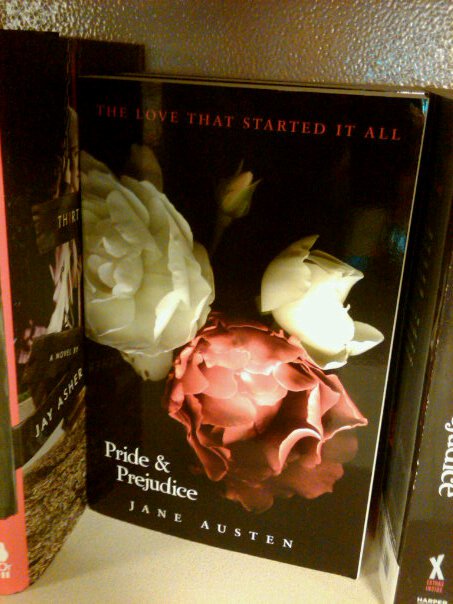
And why romance novels all look alike, despite having different flavors of silly racism:
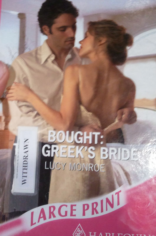
You might not agree with me, but why else would "Greek" be an important descriptor in the title?
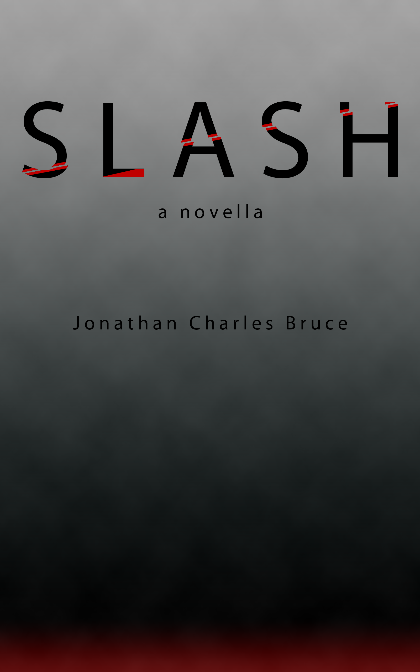
So that brings up a pretty good question: what kind of cover do I want for Project Northwoods? “But Jonathan!” you shriek to the heavens due to a rather confusing inability to learn how Internet communication works. “You have a cover! I’ve seen it with my two eyeholes!”
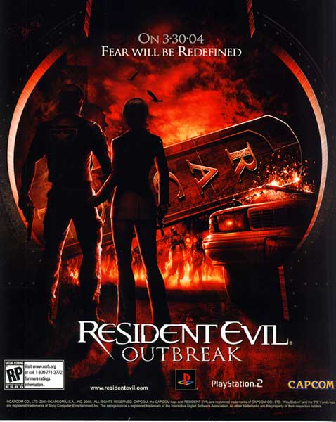
While I do indeed have a placeholder, that’s precisely what it is: a placeholder. As it stands, I have a variety of ideas for covers. I’m particularly attracted to some of the minimalist designs over here, but I’d also like something more bombastic, too. Even though the game itself was pretty terrible, I always thought that the poster for Resident Evil Outbreak was really cool – the two survivors looking down the street – if you removed the zombies – would be a pretty haunting cover for Northwoods. Or you could keep it as-is for Otherworld. You know, whatever works.
To finally get to my main point, the other day I had the good fortune to find a Something Awful Comedy Goldmine which used a fabulous web tool to make sci-fi pulp magazine covers. Because I have the artistic talent of a dead cactus, I used the Pulp-o-Mizer to science me up some gloriously retro covers for Project Northwoods. What follows are what I imagine the old science fiction pulp magazines would have done with my magnum octopus (yes, I am aware that’s from the wrong part of the episode... but they don’t have the part I’m referencing).
EAT FIST
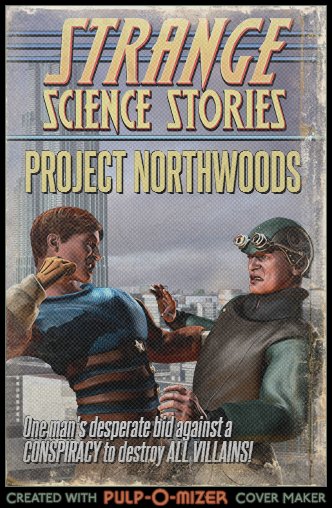
Here’s just a normal front cover. It’s not particularly awe-inspiring, but it gets the job done. Since I’m using other people’s art assets to mock up covers, some of the details are going to be inherently incompatible with Northwoods, but I’m okay with that. You see, pulp magazines were not above just throwing something that looked sensational on the cover and hoping they had stuff between the pages that meshed with the art. And if not, no big deal.
What I see when I look at this cover is Tim about to knock the taste out of an Enforcer’s mouth. Who cares if Tim is blonde and the Enforcer uniforms are grey? ACTION!
It's terrifying! You'll have to take our word for it!
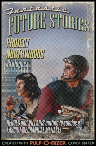
What I came up with for the prologue is actually pretty familiar fare for movie posters. Rather than show a monster, an alien, or a gigantic walking tank flattening New York, you show a couple of the protagonists looking sufficiently horrified/angry at something off camera. Sure, the city could look more prominent, but I think that the approximation of One Shot and the Emerald Dash looking skyward conveys that the enemy is huge, dangerous, and potentially unbeatable. In a way, it would be daring you to open the magazine, for within lay the horror that has paralyzed these two stalwart characters. Do you think you can handle it?
Also, I’m starting to play a bit more with the sensationalistic description. Fascist mechanical menace!? Hot damn! The Prologue and front cover are definitely the least “busy” with the words. Partly this is because I was starting off with the Pulp-o-Mizer, but also because they are pretty straightforward. As silly as it seems, I finally got around to figuring out how to encapsulate a gigantic pile of words into a simple sentence. And since the prologue is relatively short, a one sentence treatment was easy to come up with.
Manhood Compensator activated!
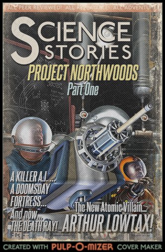
For Part One, I went with a decidedly wordier approach, but I didn’t want to get too far away from the one major aspect readers would need to know: although there are a couple of action sequences and quite a few characters introduced in Part One, the protagonist is Arthur. Further, the major story arc follows him on a particularly bad day in his journey in becoming a villain. The other stuff, while important (especially as the narrative picks up speed, characters, and plot), takes a backseat here to who is at the heart of Northwoods.
The cover sets him up as the mad scientist archetype (even though he’s technically an engineer), illuminates a few of his inventions, and features his name fairly prominently. I can’t quite figure out why they’d be in space suits – evidently, the artist on commission was told “death ray” and he or she was left to fill in the rest. Of course, this is the same pulp magazine which claims that the things within were repeatable... so maybe they kept their separate departments very, very much so in the dark as to what they were doing.
Also, he’s an “atomic” villain because people were scared of nuclear war when pulp magazines were all up in people’s business (at least, the 1950's ones). I thought it would be a neat touch.
I have my stasis capsule on loan from the Umbrella Corporation.
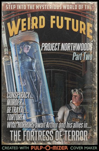
Since Part Two isn’t online because of what I’m hoping is an orgiastic desire to pay me endless money when/if Northwoods is published and not generalized disinterest, I will avoid unnecessary spoilers. Suffice it to say, shit starts getting very real at this point, and a lot of plot threads start interweaving, only to fray again at the conclusion. Once again, there’s the slightly “sexed-up” string of words on the left there. Also, there’s a woman in a tube and what looks like a space janitor looking mighty weirded out by her presence. Now, there’s not a major tonal shift – Project Northwoods doesn’t suddenly become horror by any stretch of the imagination – but once again going on the logic that publishers would want to sell copies (and due to a lack of people punching each other available on the website), I chose a theme and ran with it.
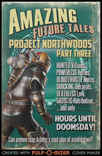
You may see a diver, I see power armor, damnit.
I really like all of these, but Part Three may be my favorite. Although it does look like a dude in a diving suit, the six people who’ve read the finale will probably know who that is. I think it also does a really good job of tying together all of the disparate themes and storylines. And good ol’ Arbiter, the consistent antagonist, finally gets a name drop. I also like the “HOURS UNTIL DOOMSDAY!” It harkens back to the life-or-death silliness of 1950's B-grade science fiction without any of the insincere sentimental claptrap that makes that crap unwatchable.
Not here! We’ve got villains that are being hunted, heroes who have been stripped of their authority, brutal mercenaries, double-crosses, love that transcends mortality, and revenge most cruel... all under the auspices of a ticking clock! Damn, if I didn’t know what was going to happen, I’d been ripping through this thing to find out.
Now, these certainly will not be the covers of Northwoods. It’s not that there’s anything wrong with the covers, but it’s not quite what I’m really looking for in my tale of super heroes punching one another. It would feel just a touch disingenuous to market it as pulp science fiction when, at the end of the day, it does not qualify as such. So, for now, I shall keep looking.
And, hey, while you’re here, if you haven’t started reading it, you really should take the time to do so. The first three chapters and its action packed prologue are free – don’t you want to see how this plays out?
(Edited 6/5/2016)
< PREVIOUS ENTRY • NEXT ENTRY >
Advice • Fiction • Gaming • General Musings • Reviews