Media - Project Northwoods Images
This page contains some of the artwork that has created with Project Northwoods in mind. Naturally, these are copyrighted images, with the exceptions being those made from the Pulp-O-Mizer.
Cover Art
Helmet provided by Scott Adkins of Adkins Historical Reproductions
Photographer - Cory Albrechtson (Facebook)
Concept - Jonathan Bruce
MUA - Stephanie Spike Drewa
Model - David Rhoads Lcct
Click Here for Original Image
Here we have a cover design that shows an embattled Arbiter giving a warcry. Why is he, one of the apparent antagonists, adorning the cover of the book? Well, he is central to the story being told, so it makes sense.
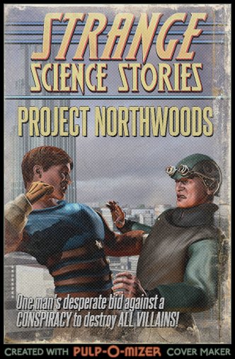
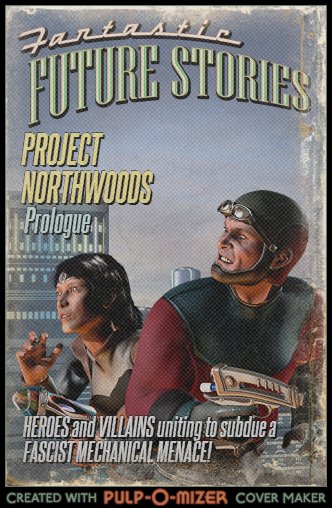
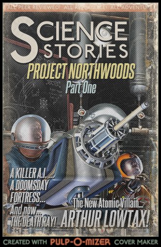
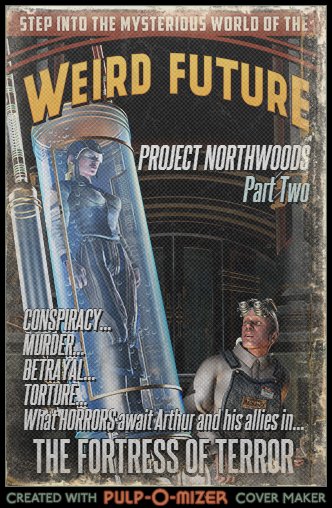
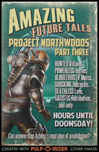
These were made for fun with the fabulous Pulp-O-Mizer, which allows people to make their own pulp sci-fi magazine covers. Obviously, this isn't official work or anything, but it provides delicious, delicious variety. Here's a blog post going into more detail.
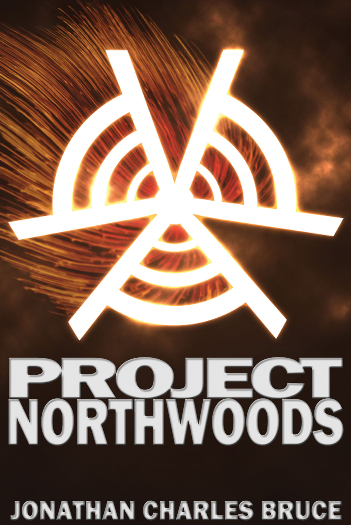
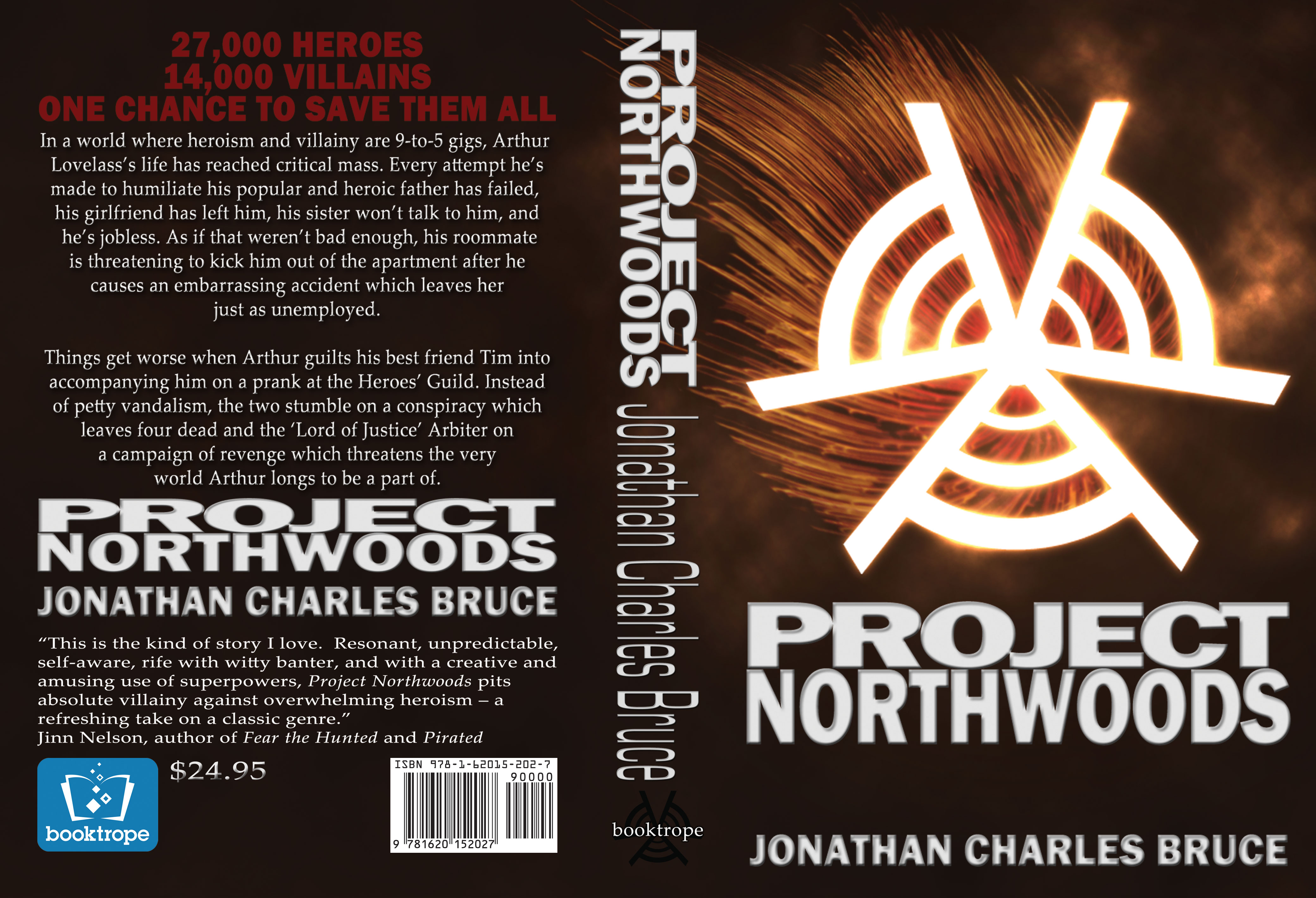
My original attempt at cover art is kind of a mess in my opinion, and I thoroughly blame the fact that I am terrible at graphic design. It incorporates some elements that KZiegler Design helpfully provided for my project.
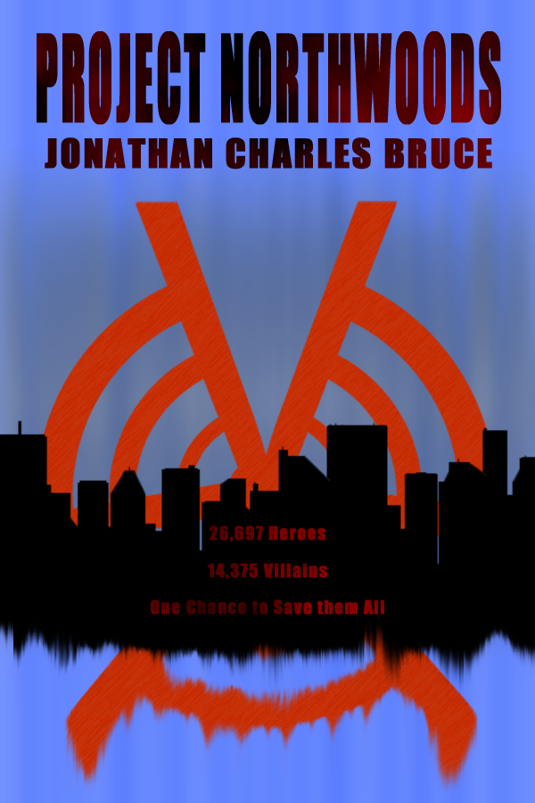
Here, I incorporated a cityscape which I made all by myself. Seriously, I'm stupidly proud of that city, because I'm resoundingly terrible at design. This one also has a sinister-sounding tag line to entice readers to read. As my lady friend pointed out, though, the numbers are probably way too specific. Nonetheless, orange and blue totally pops.
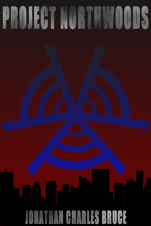
And here we move to a more sinister direction, with a deep red sky. I like how the villains' logo looks a little bit like a target or a radar screen. It's nifty, if a little bland.
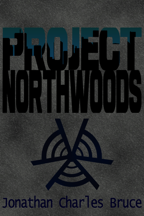
This one generally got pretty favorable reactions, with it's pavement-esque background, use of blue/green sky line (symbolism!), and generally rich texture.
Side Stuff

For those who are interested, that is Stair. Many thanks to my friend Leah for accepting my request to be included in my little expansion project.
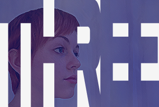
These are much cleaner images, thanks to the fact that I am slightly less terrible at Photoshop. I'm still awful, but just a pinch less so.
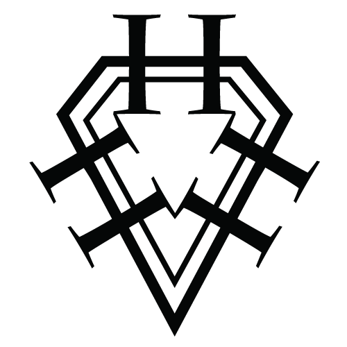
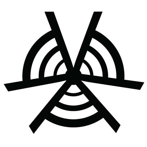
These are the logos for the heroes and villains in the novel. Yes, they have their own insignias. Yes, they are awesome. A lot of care went into these designs to make them thematically consistent with the story, so a lot of thanks goes to KZiegler Design.


I went back to the original cover design for these, obviously.
